Great thanks for mentorship Alexey Belitsky

✦ research ✦ problem solving ✦ design process ✦
Aviasales app
Navigation
Introduction
Aviasales is the leading travel metasearch company in Eastern Europe and Central Asia. It allows users to search for air tickets, hotel accommodations, and car rentals.
Members
Mentor, product designer at Yandex
product designer
The task was to select an application of interest to me, find problems and suggest solutions. Aviasales is the app I have chose. I was working under mentor supervision
Research
I've made a research with 10 users
of Aviasales
of Aviasales
There were 10 Aviasales users I spoke with. During the interview, we discussed general travel questions and walked through the app scenarios. There were a number of problems found as a result.
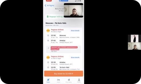
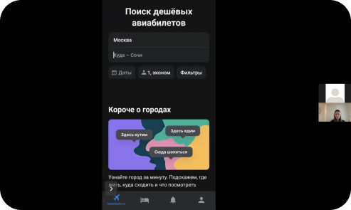
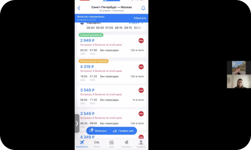
A few screens from user research


Interview report
Some of the most interesting and important problems I've discovered:
- Cliking on “to buy” button and onpening webview of partner’s company so It feels distrust to purchas
- Problem with loading content. There was some kind of loading error, it wasn’t clear what happened to the application, there was a feeling that it broken
- Lack of animal filter
- It wasn't clear how to choose a one-way ticket
- Filters also was unclear
- Signing up in the app feels useles

App map

Six scenarios: ticket purchasing, filters and options for choosing a ticket, direction selection and browsing, hotel selection, adding a notifications, profile settings
People enjoy the app, but mostly they wanted to searching only and didn't see any other useful features
What people said
I use Aviasales only for searching, and I buy a ticket from the provider company

Daniil
For me it is not clear how to choose a one-way ticket or change details one of the tickets from the screen where I see two-way ticket

Daria
On the screen purchase screen, there is a function to select the site where the ticket is placed, but I found it with difficulty.

Katerina
I see no reason to sign up in the app, I'll not receive bonuses or useful features

Anastasia
Problem solutions
I chose 4 issues that are important for business and users. The first 3 has strongly influence the ticket buying process — the major scenario. The last one could have user retention impact.
problem #1
It's not clear what happens after clicking on “to buy” button and opening web view of partner’s company. Users leave the Aviasales app and goes to purchase a ticket directly from the found company.

solution #1

problem #2
It is not clear how to choose a one-way ticket. People want to see a button for only one-way ticket when choosing a round-trip ticket

solutions #2

problem #3
On the screen purchase screen, there is a function to select the provider company where the ticket is placed, but this function is invisible

solution #3

problem #4
Signing up the app feels useless. There is not enough individual approach to the user. People want to see a bonus program or recommendations for travelling

solutions #4

Conclusion
I made a several ways to solve 4 problems.
The first solution is significant for purchasing in Aviasales. The second and third could help people to find more suitable ticket to buy. And the last one could keep attention in the app and help users to purchase faster.
I also practiced to make a moderated interviews, create a various problem solutions and improve my design process in this mentorship.
10
users were interviewed
15
problems were defined
6
scenarios in the app
Thank you for paying attention!
Thank you for reading the case study. Keep in touch with me using one of the methods below.

